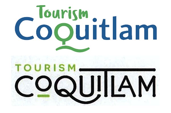
A logo for a city of Coquitlam tourism marketing campaign that cost $5,000 to design has been shelved in favour of the municipality’s current corporate logo with the word “tourism” added above.
The change was adopted last week after several councillors complained the previous week that the two logo options designed by Array Web + Creative were difficult to read.
Some council members also questioned the need for a separate tourism brand.
At a meeting March 12, staff presented council with new options, including a variation of the first Array logo done in the city’s colours along with the option councillors favoured.
The initiative is part of a $40,000 campaign that will see the creation of a tourism website for the municipality along with the use of a tagline “Fun is in our nature.”
The city’s tourism manager, Eric Kalnins, said the slogan, which council supported, captures Coquitlam’s geographic proximity to the natural environment.
“It needs to be true to place,” he told council during a committee meeting last month. “You can’t fool people by saying one thing and really presenting another… We are really capturing what Coquitlam is all about.”
The logo and tagline will begin to appear in city advertisements encouraging people to visit.
@gmckennaTC


